
Mixing Prints Like a Designer: How to Style Printed Bed Sheets Beautifully
Mixing Prints Like a Designer: How to Style Printed Bed Sheets Beautifully
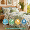
Printed bed sheets have always been a favorite in Pakistani homes. Whether it’s floral designs for a feminine touch, geometric prints for a modern feel, or bold patterns that bring personality into a room, printed bedding is a timeless part of our home culture.
But here’s the reality...
Most Pakistani bedrooms don’t unlock the true beauty of printed bed sheets — simply because we don’t style them the right way.
Beautiful prints can elevate your entire room, but mismatched colors, clashing patterns, or overcrowded décor can make the space look chaotic instead of elegant.
The good news?
You don’t need a degree in interior design to style prints like a professional. With a few smart techniques and the right selection (like KhanTex’s carefully curated printed collections), any homeowner can create a magazine-worthy bedroom look.
This comprehensive guide will teach you how to mix prints, balance colors, and decorate with printed bed sheets like a designer — all while keeping your space modern, fresh, and uniquely Pakistani.
1. Understand the Foundation: What Makes Print Styling Work
Before mixing prints, you need to understand what designers always consider:
✔ Color harmony
Different prints can work together if their colors match or complement each other.
✔ Scale (size of patterns)
Small, medium, and large patterns must balance — this is a golden rule.
✔ Theme consistency
Floral, geometric, boho, traditional — mix only within one theme.
✔ Neutral grounding
Use neutral elements to avoid visual overload.
These principles guide everything we cover in the sections below.
2. Start with a “Hero Print” Your Main Design Piece
Interior designers always begin with one bold, eye-catching pattern known as the hero print.
For your bedroom, the hero print is usually:
-
Your bed sheet
-
Or your quilt/comforter
-
Or your main pillow covers
The hero print should be the strongest pattern in the room.
Examples of KhanTex Hero Prints:
-
Large floral prints
-
Modern geometric designs
-
Boho-inspired motifs
-
Cultural patterns like Kashmiri or Mandala designs
Once you select your hero print, everything else in your bedroom must coordinate with it.
3. Use the Rule of Three: Large, Medium, Small Prints
To mix prints like a designer, follow this classic design structure:
1. A large-scale pattern
This is your boldest, biggest pattern (e.g., big florals).
2. A medium-scale pattern
This supports the large one (e.g., medium leaves, smaller florals, mid-sized shapes).
3. A small-scale pattern
This adds detail without overwhelming the room (e.g., micro-dots, tiny florals, small lines).
When these three scales interact, the room feels balanced, cohesive, and stylish.
How to apply this to your bed:
Hero: Large pattern (on bedsheet)
+
Medium pattern (on pillows or cushions)
+
Small pattern (on throw or accent pillow)
This is one of the easiest ways to style printed bedding like a pro.
4. Keep the Color Palette Consistent
You don’t want your bedroom to look like a quilt bazaar.
Even when styling multiple prints, the color palette should remain consistent.
A typical designer-approved palette includes:
✔ 1–2 main colors
(e.g., blue + white)
✔ 1 complementary color
(e.g., beige or grey)
✔ 1 accent color (optional)
(e.g., gold, mustard, peach)
Example:
If your bed sheet is navy and white floral, then choose:
-
Navy or white pillowcases
-
Soft grey cushions
-
Beige or pastel throw blanket
This keeps your room balanced, calm, and aesthetic.
KhanTex’s Printed Collections are crafted with complementary colors, making pairing extremely easy.
5. Use Neutrals to Give Prints Space to Breathe
When mixing prints, the most important technique is to add breathing space using neutrals.
Neutral elements include:
-
Solid-colored curtains (white/beige/grey)
-
Neutral headboard
-
Plain cushions
-
Solid quilt or throw
-
Wooden furniture
-
Neutral-colored rugs
These soften the busyness of patterns and keep the room aesthetically pleasing.
Designer Tip:
If you are mixing 3 printed items, add at least 2 neutral items to balance your space.
6. Keep One Print Dominant and the Rest Subtle
A common mistake homeowners make is mixing too many bold prints with equal intensity.
This creates visual clutter and ruins the look.
Instead:
✔ Choose 1 strong print
✔ Keep all other prints soft, minimal, or small-scale
Example:
If your bedsheet has bold red roses, your cushions should have:
-
Light beige body
-
Soft botanical leaf prints
-
Small understated florals
This is how designers keep the room elegant instead of overwhelming.
7. Mix Prints Within the Same Style Family
The easiest and safest way to style prints beautifully is to stick to one style family.
✔ If your bed sheet is floral, mix with:
-
smaller florals
-
leaf patterns
-
branches
-
watercolor-style florals
✔ If your bed sheet is geometric, mix with:
-
stripes
-
dots
-
grids
-
finer geometric shapes
✔ If your bed sheet is boho, mix with:
-
ikat motifs
-
tribal prints
-
simple bohemian line art
Designers rarely mix florals with geometric prints unless the colors match perfectly.
KhanTex collections often follow style families, making this step simple.
8. Pair Printed Bed Sheets with Solid Accessories
If you’re nervous about mixing prints, here’s the easiest designer-approved formula:
Printed Bedsheet + Solid Pillowcases + Solid Throw
This combination is:
-
Elegant
-
Balanced
-
Easy to style
-
Always looks premium
-
Works with every room size
-
Keeps focus on the star print
Choose solid-colored accessories that match one of the colors in your printed bedsheet.
KhanTex solid pillowcases and plain accessories are perfect for completing these looks.
9. Go Monochrome for a Modern Designer Look
Monochrome styling is a big trend in 2025–2026.
It creates a high-end, minimalist feel while still allowing you to play with prints.
✔ Examples:
-
Black + white
-
Shades of grey
-
Different tones of blue
-
Cream + beige
-
Shades of pink
Why monochrome works:
Even if you mix patterns, the color unity keeps the room cohesive and visually calm.
KhanTex monochrome printed collections are ideal for this theme.
10. Use Printed Layers for Depth and Dimension
Layering is how designers create luxurious bed setups.
Best layering formula:
Printed Bedsheet
+
Solid/Lightweight Quilt
+
Accent Throw (printed or textured)
+
Mix of printed + solid cushions
This creates depth, texture, and richness.
Designer Tip:
If the bedsheet is printed, the quilt should be solid (and vice versa).
This instantly elevates the bedding.
11. Use Lines and Geometric Prints to Create Optical Illusions
Certain prints can make your room appear larger or more symmetrical.
✔ Vertical lines
Make your room look taller.
✔ Horizontal lines
Make your room look wider.
✔ Micro-prints
Add sophistication without crowding the space.
✔ Repetitive geometric prints
Create a sense of harmony and balance.
KhanTex geometric collections help create these designer illusions naturally.
12. Balance Warm and Cool Tones
Designers mix warm and cool tones for harmony.
Warm tones:
-
Brown
-
Maroon
-
Beige
-
Mustard
-
Peach
Cool tones:
-
Blue
-
Grey
-
Mint
-
Purple
-
Teal
Designer tip:
If your printed bedsheet is warm-toned (e.g., browns or reds), add cool-toned accessories like grey or blue cushions to balance the room — and vice versa.
13. Consider Your Bedroom Furniture Color
When styling prints, your furniture affects the outcome.
✔ Dark furniture (walnut, sheesham)
Pair with light prints.
✔ White furniture
Pairs beautifully with both bold and subtle prints.
✔ Golden-trim furniture
Choose elegant florals, royal patterns, or geometric prints.
KhanTex printed bed sheets are designed to complement all three.
14. Match Prints with Curtains and Rugs (But Carefully)
You can match your prints with curtains, but not excessively.
✔ Good matching ideas:
-
Same color family
-
Same style family
-
Same scale family
-
One printed, one solid
✔ Don’t:
Use big prints for both curtains and bed sheets.
This overwhelms the space.
A printed bedsheet looks stunning with:
-
plain curtains
-
textured curtains
-
lightly patterned curtains in a smaller scale
15. Real Pakistani Homes That Style Prints Perfectly (KhanTex Customer Inspiration)
From Lahore to Karachi, our customers use the following combinations beautifully:
✔ Soft florals + beige cushions + textured throw
Classic and timeless.
✔ Blue geometric prints + navy solid pillowcases + white curtains
Modern and sharp.
✔ Pink pastels + floral pillow covers + white quilt
Feminine and elegant.
✔ Botanical prints + wooden furniture + light neutral rug
Nature-inspired and peaceful.
These combinations show that printed bedding can be incredibly stylish when thoughtfully styled.
16. Best KhanTex Printed Collections for Designer-Level Styling
✔ Floral Elegance Collection
Perfect for feminine and romantic rooms.
✔ Geometric Modern Collection
Ideal for minimalist and contemporary interiors.
✔ Boho Spirit Collection
For artistic, expressive, and trendy décor lovers.
✔ Botanical Nature Collection
Fresh, airy, and calming.
✔ Minimal Print Collection
Small-scale prints that blend well with solids and other designs.
Each collection is designed to help homeowners style prints effortlessly.
Conclusion: You Don’t Need a Designer, Just the Right Techniques
Mixing prints can feel intimidating, but with the right rules, anyone can do it beautifully.
To recap:
-
Pick a hero print
-
Use the rule of three (large, medium, small)
-
Keep the color palette consistent
-
Use neutrals to break intensity
-
Stay within a style family
-
Layer wisely
-
Balance warm and cool tones
-
Choose KhanTex prints for effortless styling
With these techniques, your printed bed sheets won’t just decorate the room
They’ll transform it into a designer-level, Instagram-worthy space.


